Waiting with a number of students in the lobby of Lab Central for Class 5 to get started, we turned toward the entrance, hearing a loud, high pitch voice of someone singing and cheering through the entrance of the building. Accompanied by Youth CITIES founder Vicky Wu Davis, aka her mother, as well as her eight and eleven year old brothers, it was none other than Sanibel, the famous four year old students have been learning about and beginning to design for! She entered the building dragging a rolling suitcase that was bigger than her, and when it got stuck on the doorframe and her brothers jumped to help out, she screamed back “My do it!” in the most adorable voice I’ve ever heard. Once we all entered the classroom Sanibel hopped onto a rolling chair while her brothers pushed her around the room to say hello to all the students.
In the last several weeks we’ve covered a number of topics related to technical innovation, user oriented design, accessibility design, early stage prototyping, and a number of other topics, but today was largely about putting that into practice and introducing the students to user interaction with Sanibel. Students prepared basic low fidelity prototypes and activities that they wanted to test with Sanibel, spending only five minutes per team engaging with her at the start of class. This part of the design process is so critical, and often the part of the process that sparks the biggest changes in your design, changing your beliefs or proving your previous assumptions entirely wrong. It’s something that I’ve taken entire classes on at Olin, where the expectation was to engage in 10-15 user discovery sessions over the course of a few weeks to really understand who you’re designing for, so while it’s impossible to get into such a level of depth here in such a packed class, we tried to prime students with a couple key takeaways to keep in mind when engaging with a user. First, we asked them to focus on testing a single idea/assumption at a time, and to design their prototypes around testing one piece of their idea’s functionality. For example, when I user test the software that I’m a UX designer for, I may be testing a complex piece of functionality that can do many different things, but the questions I’m asking are designed in such a way that I’m focusing in the interview on one function of the idea at a time. Second, unable to test in Sanibel’s natural environment, like her backyard or her classroom, we asked students to try and design their experiments in a way that best simulated that environment. This is where Vicky came in, sharing her experiences to help create a more natural testing environment.
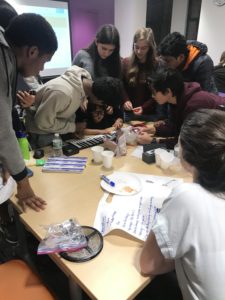
 Digging into what teams have been exploring (finally!), the first group with Sanibel has been exploring ways to make it easier for Sanibel to learn to play piano. With some ideas around applying color and audio feedback to the experience, they had Sanibel play with a keyboard,asked her to identify colors and objects from a distance, and also had her play the piano with a pair of glasses on to test if the concept of a wearable would be annoying for her. (This was also a cute moment when Sanibel screamed “it’s better!” as she started playing with a pair of sunglasses, and ran away cheering; a bit of a placebo effect!). In a followup conversation we held as a group where each team discussed their observations, I pushed them to think of more ways that they could get physical with their testing to explore their ideas, for example by putting some colored dots on the piano or shouting phrases to Sanibel as she played to simulate their audio feedback idea.
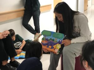
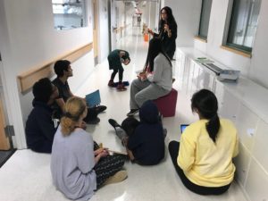
 The second group was interested in improving Sanibel’s reading experience in the classroom, but hadn’t yet found a specific idea that they wanted to focus on. We aren’t setting deadlines for when teams need ideas, but this does change the types of questions and discovery they might do. They setup a space to simulate group reading, with the “teacher” on a chair surrounded by Sanibel and the other students. They read a book with large images of objects and their names each on a page, and asked her to name the objects. After reading and spelling out “apple” (and her laughing because we said “P”), they asked her to identify the apple in a collection of other images. They did a great job of simulating the experience and capturing the ways that Sanibel engages with reading activities, rocking on her legs and frequently leaning in to look closer at the page.
The third group also wanted to observe Sanibel reading, but they wanted to test an idea for having Sanibel read on her own through a magnified screen of some sort. To test the idea (after which they can define it more clearly) they had Sanibel read a book. But while this idea might have merit for someone learning to read with a visual impairment, Sanibel doesn’t yet know how in the first place, so they quickly saw her disengage from the activity. I saw them quickly pivot to test the idea in different ways, and being spontaneous in user engagement is super important. They then tried to get her to follow along as they read, but had her looking through the iPhone, something Sanibel is known to do at sports games with her family. But with the book so close by, Sanibel’s attention was still drawn to that and not the magnified image on screen.
Another interesting engagement from this team emerged around them having Sanibel read that same book with the single words and pictures. The book featured buttons that had the image of the object and would say the name of the object out loud. This prompted an interesting discussion later on about how engineers design interactions for their products. Here we saw Sanibel really engage with the button, but why? Was it the tactile sensation of pressing it? The sound it emitted? The bright image on the button? As this team (and every other team) designs experiences for Sanibel and designs devices with buttons, colors, audio feedback, etc. it’s important to understand what gets Sanibel most excited in order to maximize her engagement with the device. The engagement with the button was unintentional, but illustrates the importance of designing user testing experiences to hone in on a single element of a design or interaction. For example, if the tactile element was most exciting, it might not make sense to design a device with a big clickable power button, else Sanibel will be more interested in turning it on and off than actually using it.
 The final team created an obstacle course for Sanibel to understand how she navigates the built environment and had shown previous interest in object detection devices to prevent Sanibel from tripping and bumping into objects. Their obstacle course had everything from large chairs to pizza boxes to small toys littering the ground. To the team’s surprise, she ran through with almost zero issue, stopping once to double check her footing as she weaved through the pizza boxes. Then they asked her to make her way down the stairs, retrieve a basketball, and bring it back up. Here they noticed some greater challenges as she navigated down the stairs leading with the same foot every time, dropping the glasses they put on her, and struggling to grab her eye as she often does when her hands were full with the basketball. As we debriefed, I asked the team whether they thought their initial test of the obstacle course validated their initial assumptions. Putting myself back in the shoes of a high schooler, I realized that it might be hard to admit that the work you put into something was a failure, and this team wasn’t ready to say that their obstacle course didn’t go as expected. But what I wish I had stressed more in that moment was that a failed hypothesis isn’t failure, just an opportunity to update your way of thinking and try again. Todd Reily, the creative lead at Bose, also stressed this in class one: you need to be comfortable exploring those dead ends in order to reach truly innovative solutions. I hope everyone can come away from the course with this in mind. I don’t know what the team will do next, but from their testing maybe they can explore the challenges they did observe as Sanibel climbed stairs rather than helping with object detection on the ground, or maybe there’s another challenge with obstacle detection that future testing could identify!
To wrap up, teams split into stations where they met to discuss how they might use Bose technology in their idea (remember this is a required design restraint), discussed using TinkerCAD for their designs, met with Sanibel for additional time, and reviewed the finale requirements for the class. Next week class will be fully focused on work time toward fleshing out their ideas, and after that it’s the finale! Not much time left, and I’m amazed at how far the teams have come given how little time they truly have here. User testing is extremely important and innovative, and I can’t wait to see how it inspires their designs!
